
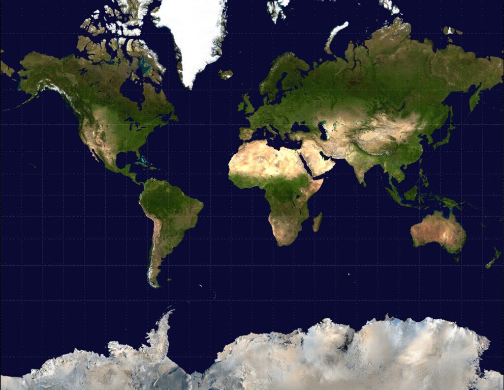
Looking at Greenland and Africa on the Mercator projection map, they appear to be about the same size. In reality, Africa is about 14 times the size of Greenland.
The discrepancy doesn’t come because the Mercator projection is wrong, but because of what was prioritized in the creation of it—and what was sacrificed. On Sept. 4, the United Nations (U.N.) voted to endorse the Equal Earth projection, encouraging the use of a map that more accurately represents the size of continents.
Trying to accurately translate the spherical shape of the world onto a flat projection is no easy feat. While the Mercator projection preserves direction, making it helpful for navigation, it distorts the relative sizes of landmasses — in particular, those farther from the equator. The Equal Earth projection is designed to preserve the relative size of landmasses.
Gerardus Mercator created the map in the 16th century to help sailors navigate the oceans. Jamie Gates, professor of sociology at Point Loma Nazarene University, said that when thinking about the Mercator projection, it is important to also consider the context in which it was made.
“European map-making carries with it the legacy of its imperial and colonial intentions,” Gates said in an email interview.
The Mercator projection has been so familiar it is easy to overlook. It hangs on the walls of schools, offices and homes, becoming part of the background of daily life. According to Gates, consistent exposure to something like this has the power to shape the way people see the world.
“From an anthropological perspective, maps are never purely objective or scientific pictures of reality,” Gates said. “They are cultural artifacts that construct a specific way of seeing and being in the world.”
Elianna Shattenberg, a first-year health science major, said she knew Africa was big, but said that when she first saw the visualization she was taken aback by how large the continent actually is. Shattenberg lived most of her life in Madagascar and then spent four years in Kenya. She said that she commonly sees people mistakenly group all of Africa together as homogenous.
“Africa is actually so many countries and so many cultures and I think there’s a big misunderstanding that it’s not just one culture, it’s not just one country,” Shattenberg said.
Shattenberg said that she doesn’t think the map change will affect her life, but she does have hope that the new map might help expand people’s understanding of the vastness of Africa.
“Maybe seeing how big it is will help other people realize that it’s not just one culture in one dynamic, it’s so many and it’s all intertwined to make Africa what it is,” Shattenberg said.
The resolution does not disallow the use of the Mercator projection or require it to be replaced. Instead it encourages the use of the Equal Earth map when relative size is important.
The resolution was sponsored by the African nation of Togo and 164 countries voted to pass it. Six countries abstained from voting while only one, the United States, voted against it.
Rosco Williamson, a history and political science professor at PLNU, said he believes the vote was effectively a recognition that the European understanding of the world which dominated the national stage for so long, is not the only way of operating.
“It doesn’t really change anything, it’s just a recognition that the U.S. doesn’t want to recognize,” Williamson said.
The U.N. framed the resolution as an “act of cognitive justice” intended to help make an intentional shift towards equality. Gates, like Shattenberg, has hopes that this might just increase our question asking and willingness to learn.
“If all this change in maps does is raise our curiosity in what’s happening in this neglected part of the world, it’s a good change,” Gates said.

 Nathan Gibbs